
Resources
Here you can find blog posts, thought leadership, webinars, and other related industry and product news.
The Business Blog


Webinars

How to save a live event in real time
Read more.png?width=500&height=500&name=Untitled%20design%20(12).png)
Intelligent Video Today
Read more
How can video communication make transformation successful?
Read more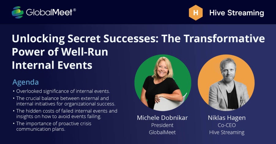
The Transformative Power of Well-Run Internal Events
Read more
Why should enterprises invest in doing live video communication?
Read more.png?width=900&height=470&name=CEO%20insights%20(2).png)
How should you organize yourself around video?
Read moreReliability, video experience, and communication impact start with Hive
Speak to a real human and start your journey with Hive today.