
Resources
Here you can find blog posts, thought leadership, webinars, and other related industry and product news.
The Business Blog

Webinars
.png?width=500&height=500&name=Untitled%20design%20(12).png)
Intelligent Video Today
Read more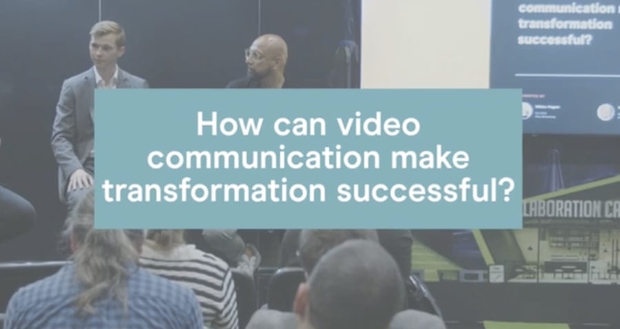
How can video communication make transformation successful?
Read more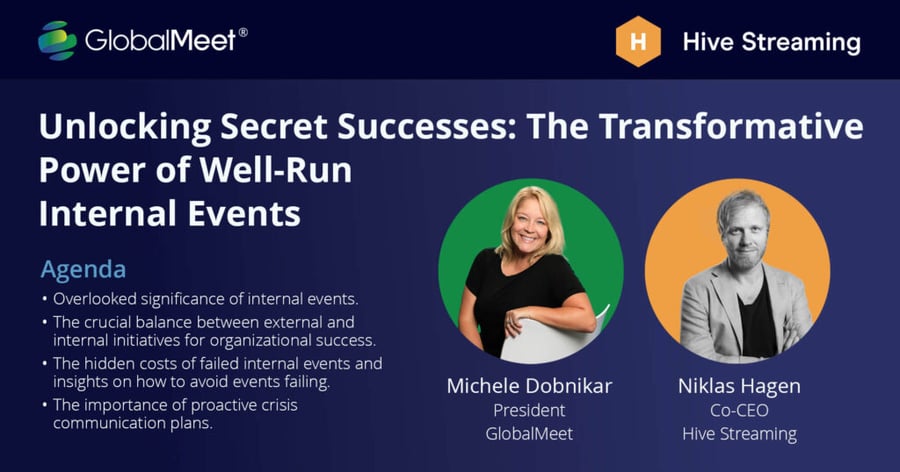
The Transformative Power of Well-Run Internal Events
Read more
How to save a live event in real time
Read more
Why should enterprises invest in doing live video communication?
Read more.png?width=900&height=470&name=CEO%20insights%20(2).png)
How should you organize yourself around video?
Read moreThe best employee video experiences start with Hive
Get connected with one of our product experts to begin your journey with Hive today.